

project overview
Led redesign of OnTrees, an app that helps people understand and see all their money in one place. The success of the app led to its acquisition by MoneySupermarket in 2014.
Deliverables: Product and design direction, workshop creation and conduction. App branding, architecture and testing. Management, lease with design, development and business teams.

The challenge: Redesign OnTrees Version 1
Originally launched as a venture project from DMG-Media to enter the personal finances space, OnTrees first version was built as a pilot to prove market appetite at a time where companies like Monzo didn’t exist.
In August 2013 OnTrees CEO assembles a new team and I join as design lead; my first task is to direct OnTrees redesign.
unifying vision & team
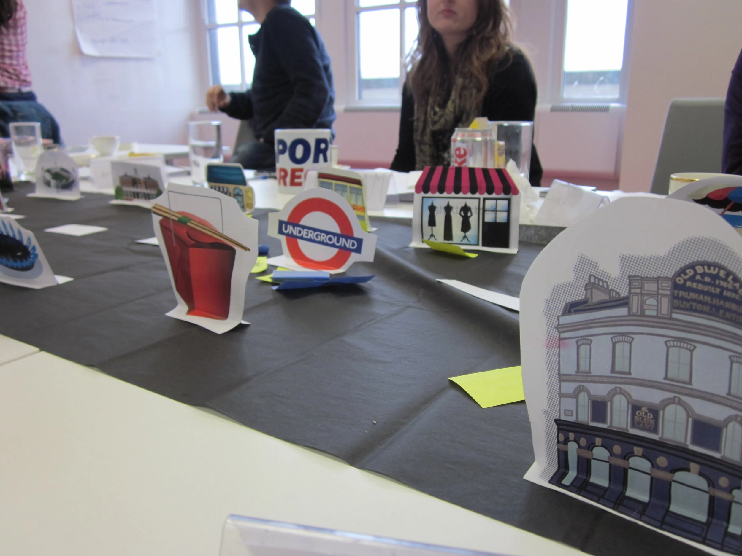
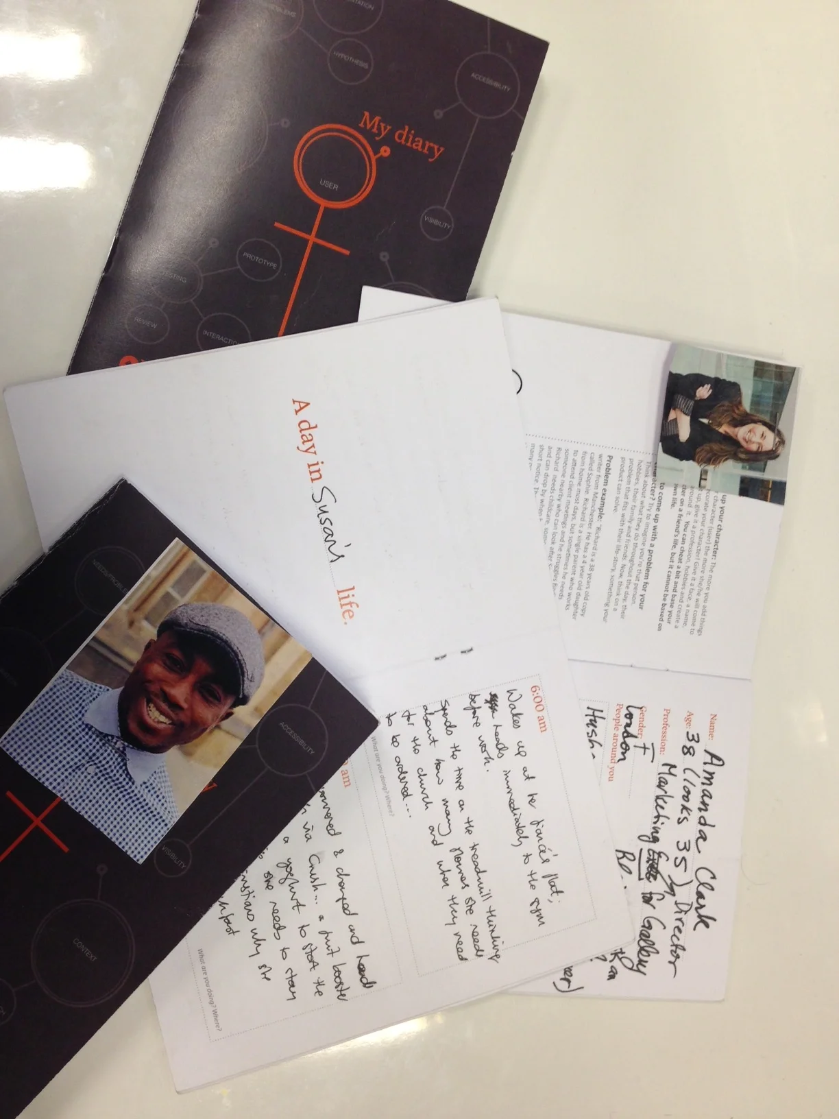
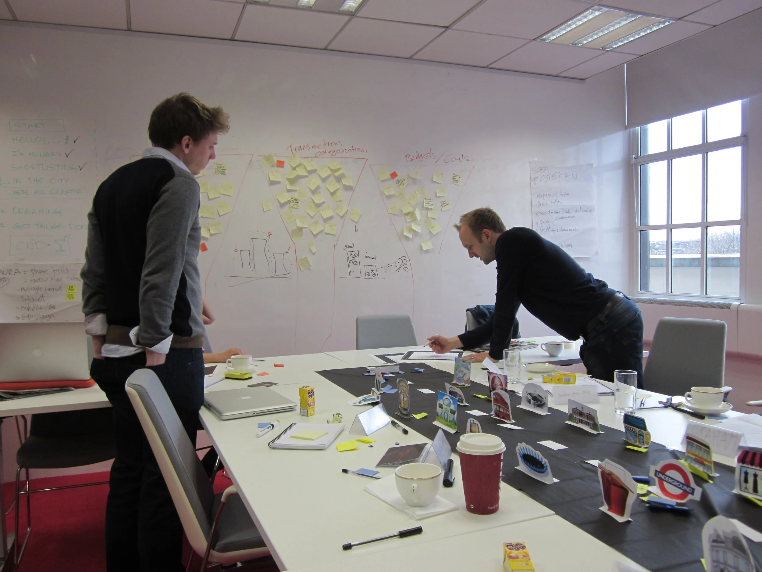
One of my first tasks as lead designer was to create and conduct a bespoke workshop to unite the team and product vision.

What we achieved
Brought tech and business to the design process, increasing team’s ownership.
Identified user’s needs to ensure new version addressed user’s pain points: gave priority to a mobile solution that met needs of users for checking their money on the go.
Consolidated OnTrees value proposition and company vision for an app that helps users see and understand all their money in one place.
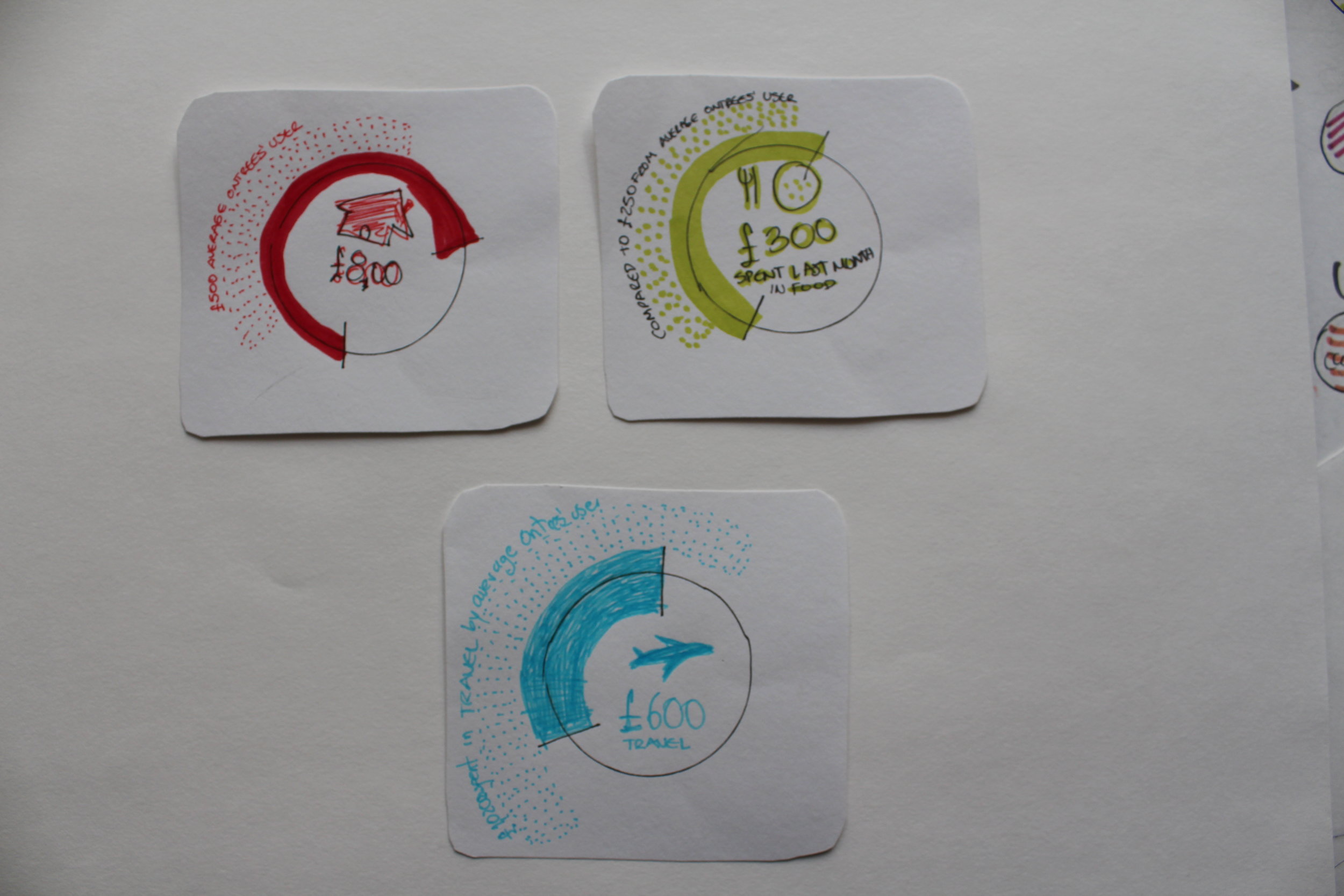
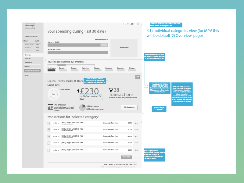
visualising users questions
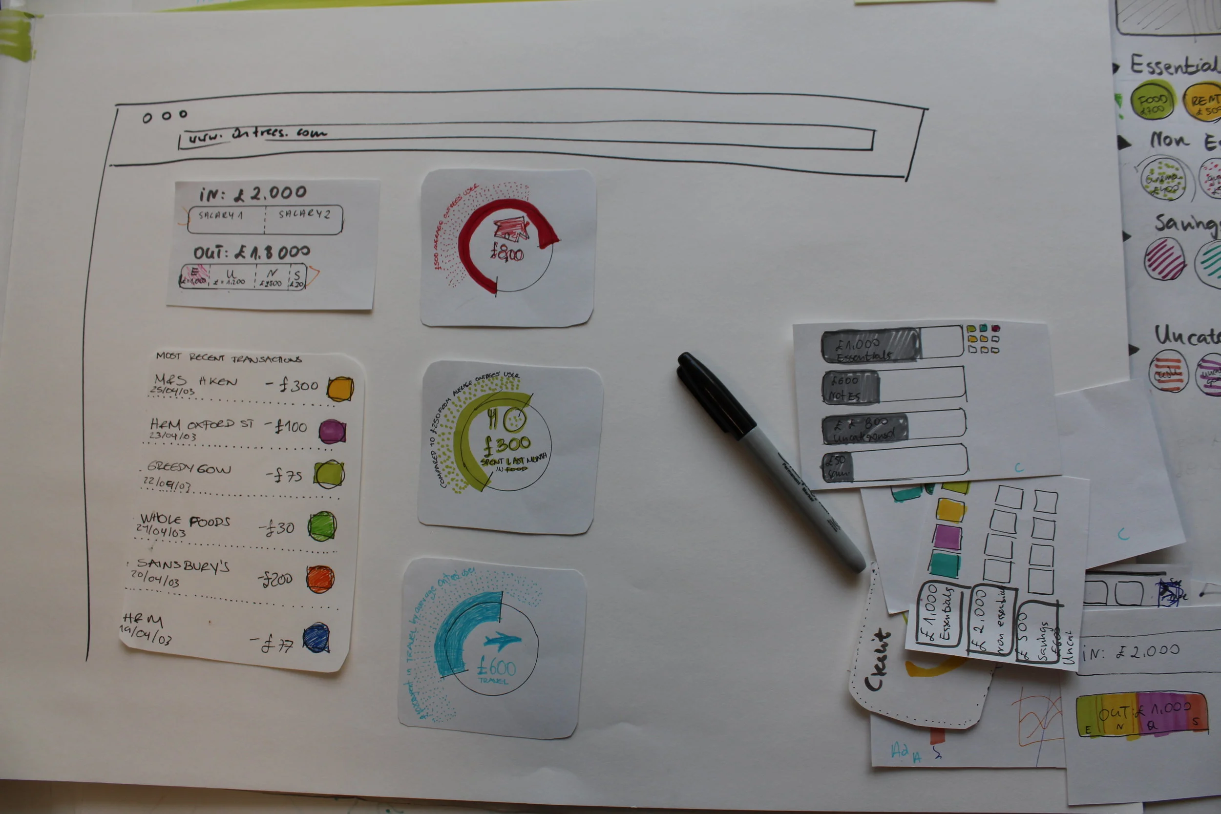
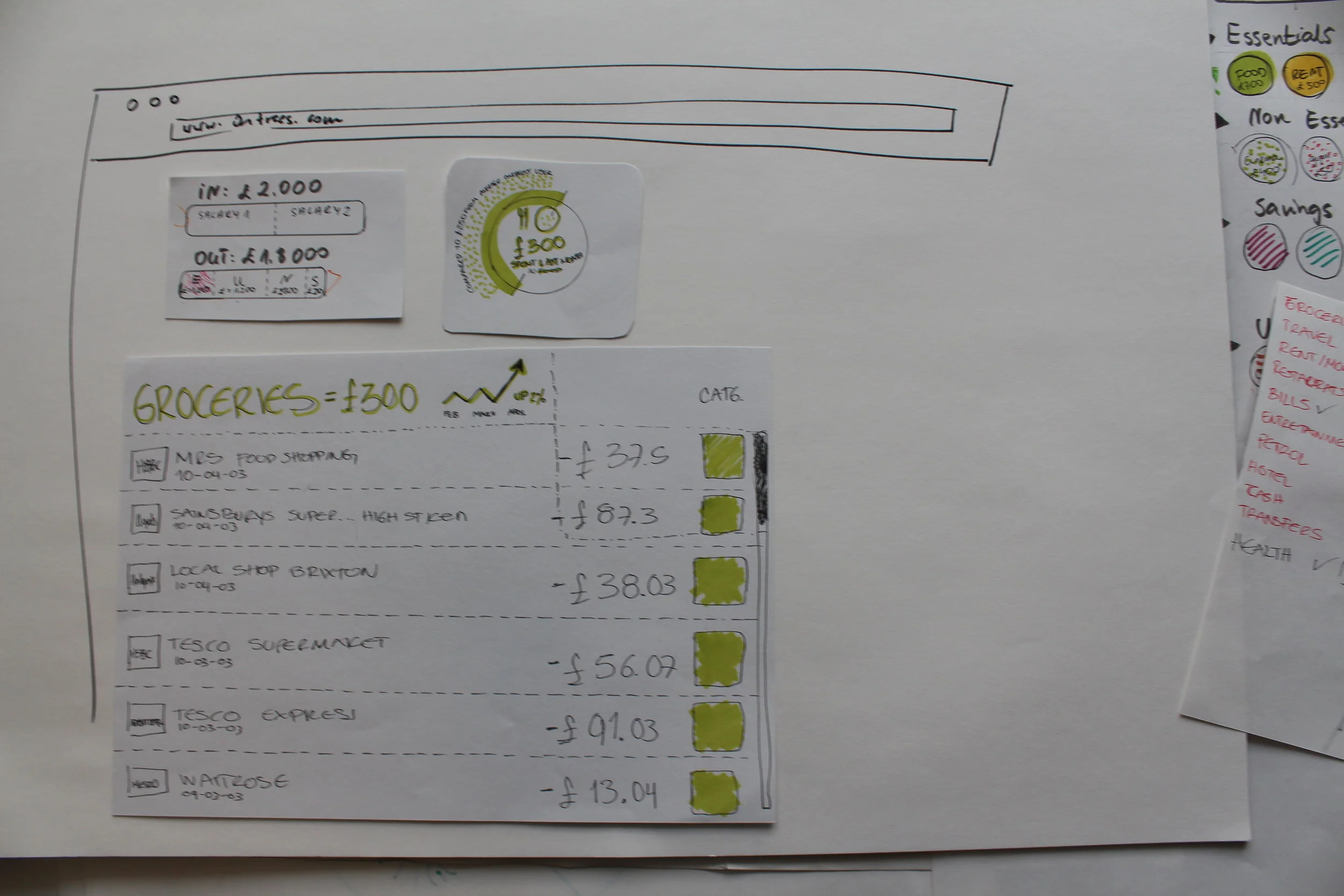
During this phase, I concentrated on sketching solutions to key user needs identified in workshop:
“How much money do I have in my account(s)”
“Where’s my money going?”
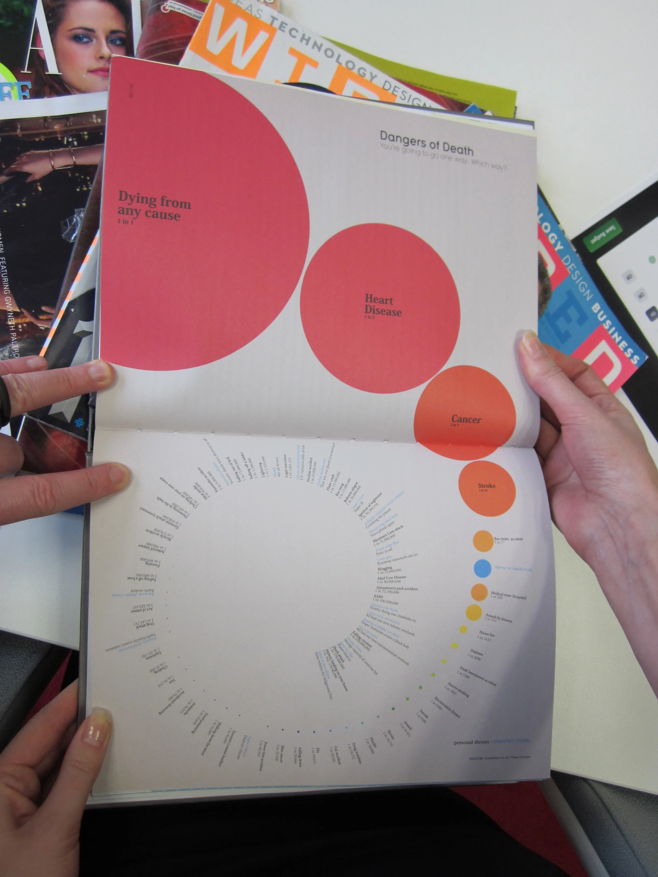
We also learnt that pie charts confuse people when used as category breakdowns, so we found alternatives ways of visualising this information.

testing hypotheses
By talking to OnTrees beta users (a group of 40 people that had used Version 1 and wanted to help us improve new version) we validated and sometimes rejected hypothesis.

Rejected concepts
We tested a concept to categorise spending into essentials/non-essentials areas. After a combination of card-sorting exercises and analysis of transactional data sets, it became obvious that this feature would require a high level of customisation. People’s perception of what was considered essential to them varied drastically from person to person. I simplified the design and only split the view of transactions by money coming in and out.
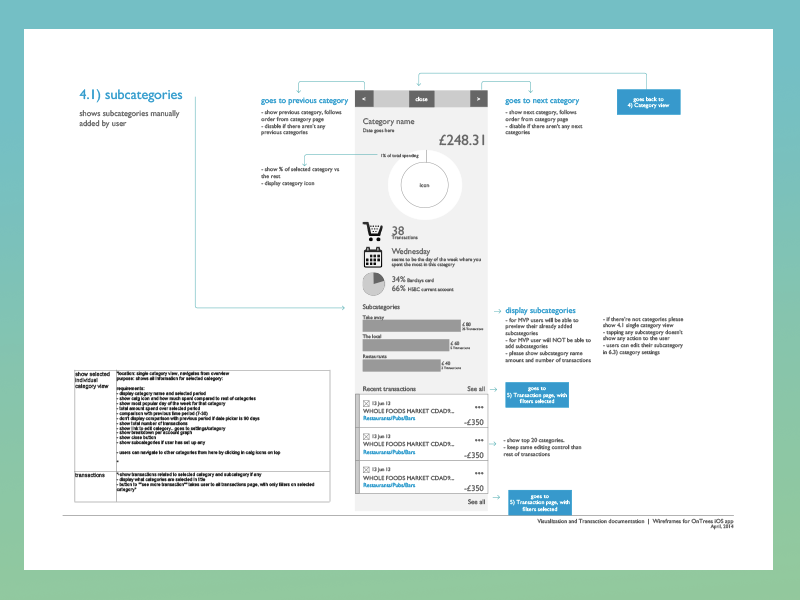
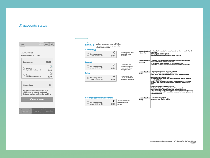
Ontrees architecture
Once I had an idea of what users wanted to see in the app, I started to formalise different areas of the app by creating architectural plans that guided the scope of what was to be Version 2 of OnTrees.


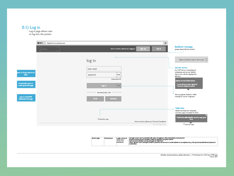
Building core components
I worked in parallel with tech team in an Agile manner and using UI guidelines in a time where Material Design didn’t exist. We set principles for core design elements such as forms, which were particularly important to OnTrees as they handled the bank integration between users and third party provider Yodlee.


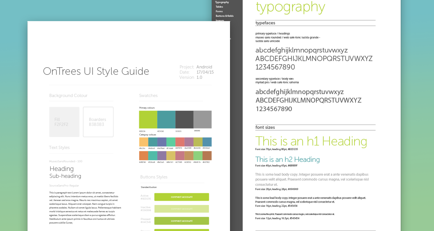
brand evolution
“Every transaction in your bank account represents something you have done in your life. A coffee you had with a friend, a summer trip or a doctor’s appointment.”
We used sprint colours and rounded lines in our typography, logos and iconography to appear more approachable and friendly. Finances didn't need to be scary.
I wanted to move away from traditional financial services and tell the story of your money in a new way: simple, playful, fresh and approachable.
Showing your spending across different areas in a more playful and informative way.
"Wednesday is the day you the week you spend
the most on Restaurants"
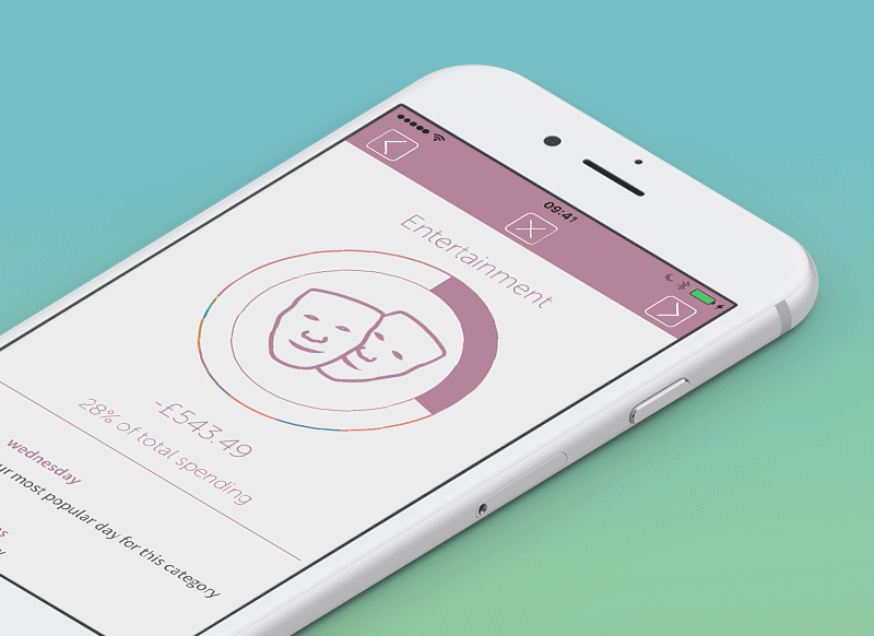
Giving you the tools to see information that helps you make sense of your spending.
"I only want to see how much I spent over this specific time period"

the result
A web, mobile app and Apple Watch company that helps users see and understand their spending.


Desktop view: spending breakdown and a rejected concept for same page.

Desktop and iOS app (Account balance)

Apple watch - Category breakdown

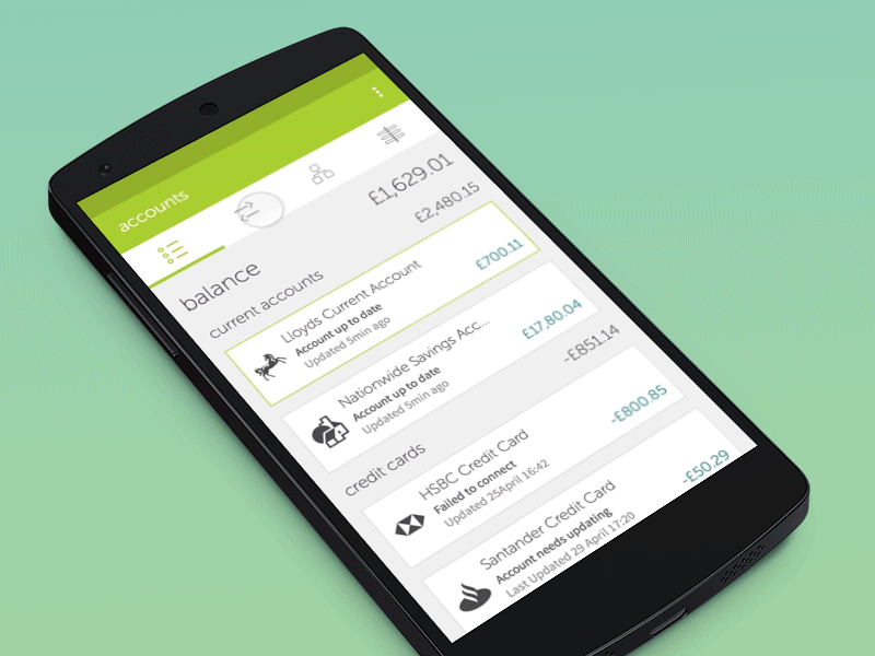
Android Platform - Accounts balance and spending Overview

Testing concepts for a new budgeting section

Failed to meet budget for the month.

Achieved budget for the month
Next project

Dyson