

project overview
Just Be team tasked R/GA with the creation of their brand and end to end product design for their new SME (small to medium size enterprise) payment company.
As part of of a small team of UX/UI designers, my role was to create the sign up, onboarding, my account and checkout experience for this new ventures platform.
Deliverables: strategy & user flows, designs and prototypes for Just Be sign up process, SME onboarding and authentication journeys, my account and checkout.

The challenge
• Create a smooth digital onboarding experience for new SMEs registering in the new platform while providing all necessary identification checks (Company’s house) while handling legal requirements for different regions and business types.
• Define the experience and designs for My Account & Checkout flows, reutilising patterns from onboarding experience while catering for all scenarios with SME from different sizes, regions and at different stages of authentication process.
• Grow Just Be UI and motion library, providing designs and motion guidelines.
strategy
As part of product definition, I created strategy maps that helped R/GA and the business team at Just Be, guide the design of different areas in the platform; from introduction of the product to new businesses, to conversion and retention for different customers mindsets.
User Journeys
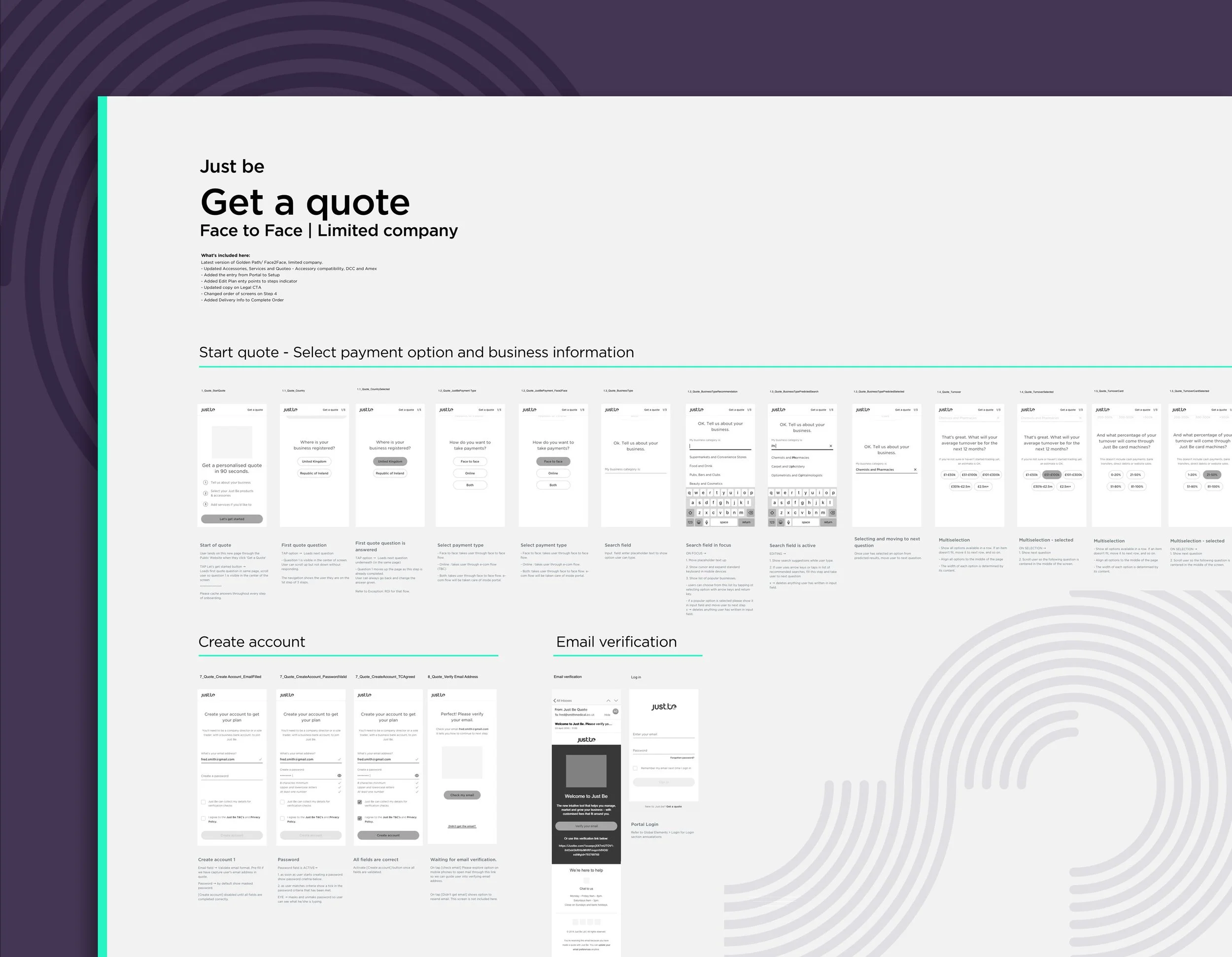
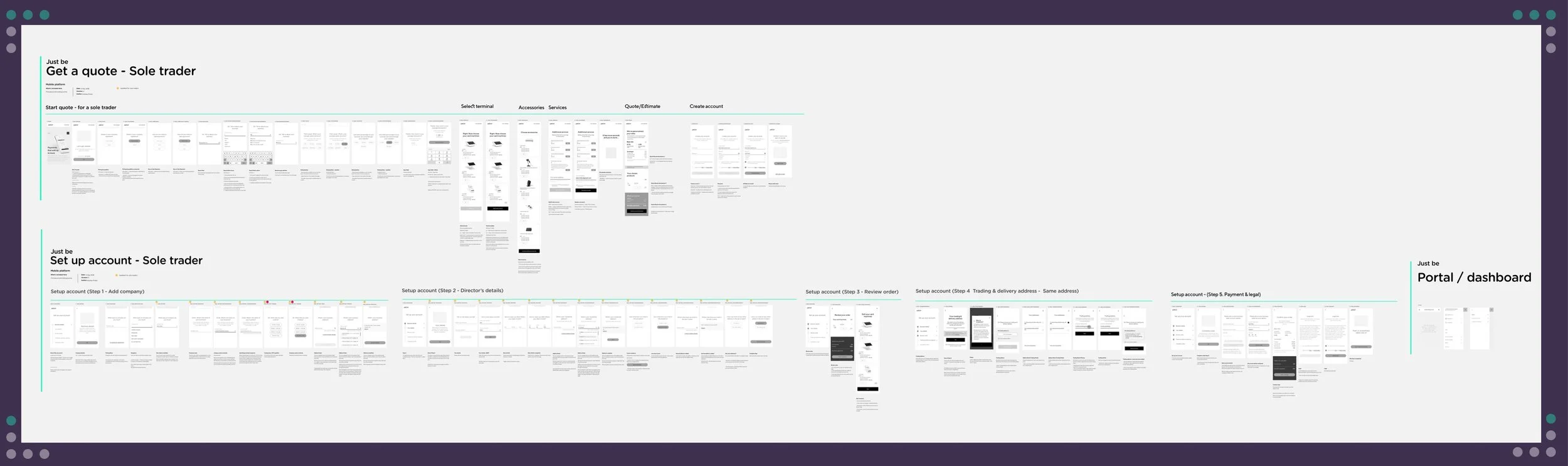
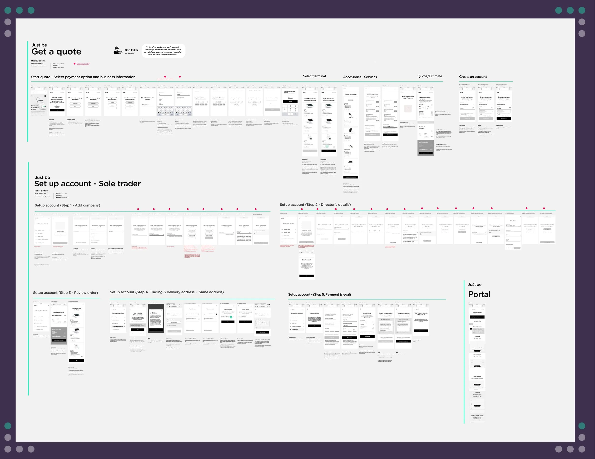
The biggest challenge we faced during sign up process, was the handling of the authentication of SME businesses in order to get set up in the Just Be platform. SMEs needed to confirm their identities, company structure, etc. using live-checks with institutions such as Companies House. This meant a great challenge for the user experience as there were hundreds of scenarios.
The User Journeys flows below, are an example of tools we used to define the steps to onboard and set up a new business online.
Core journeys
All the user flows where mapped out into wireframes that illustrated the flow for each user type, while serving as guidance for creating design components in next phase.
Complex flows
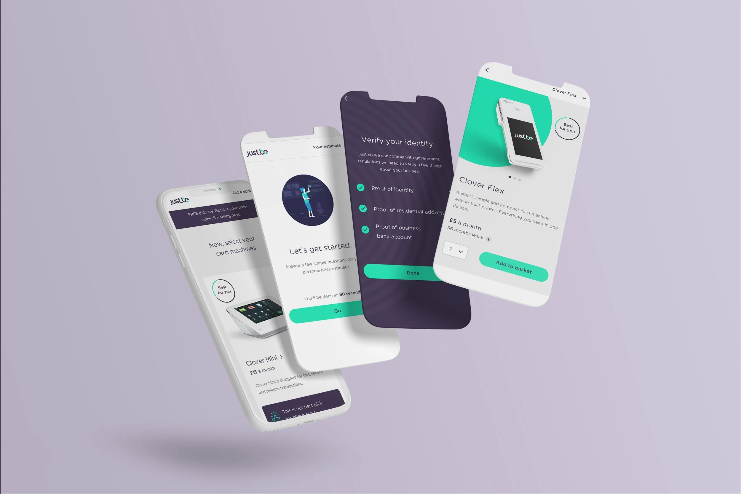
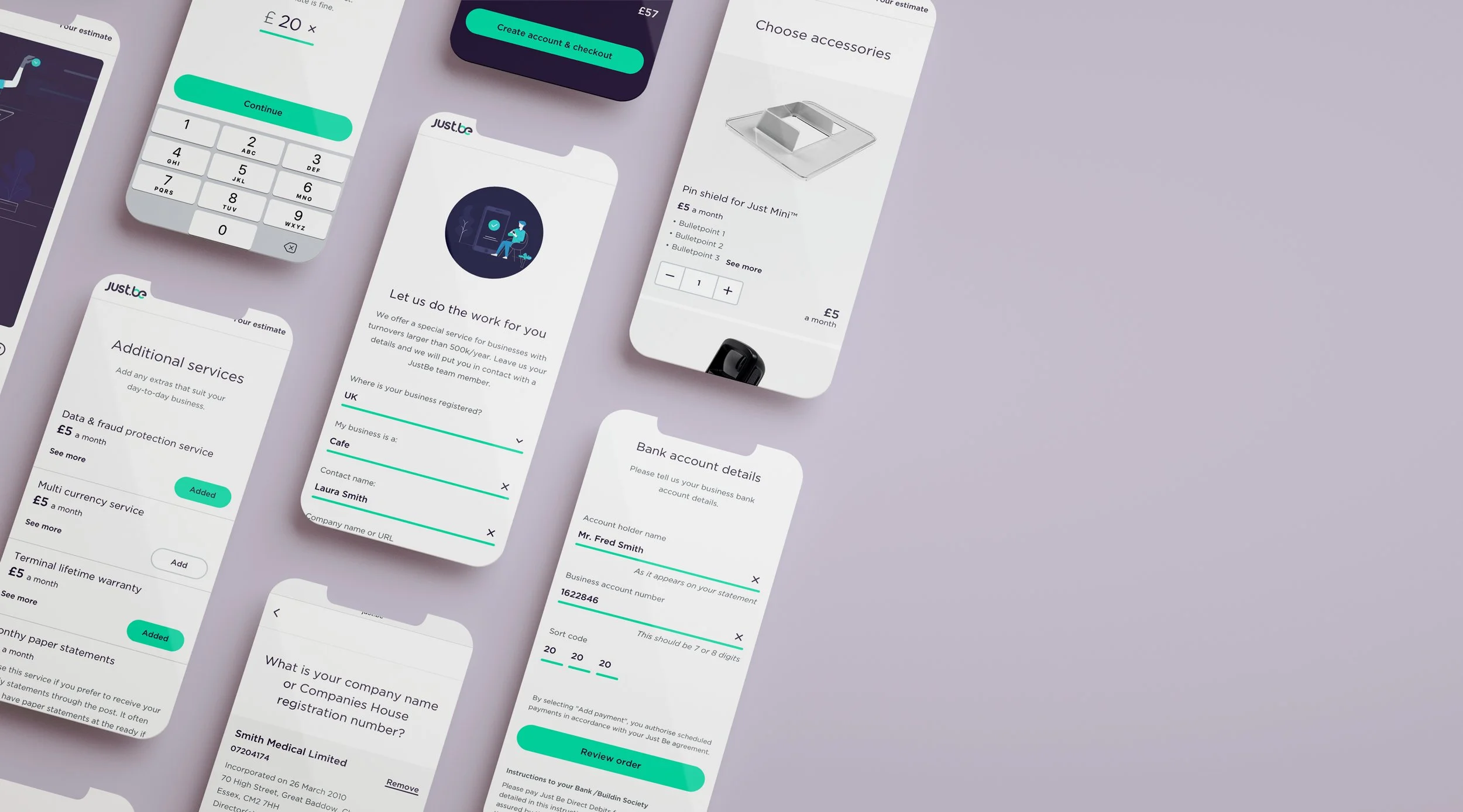
Each user type had a onboarding/set up journey that needed to be mapped out. Sole traders, limited companies, ROI, each had a screen flow mapped out for scenarios such as getting a new quote, returning to retrieve a quote, company authentication and errors. In addition to these, wires for account management and checkout screens were produced.


Visual designs
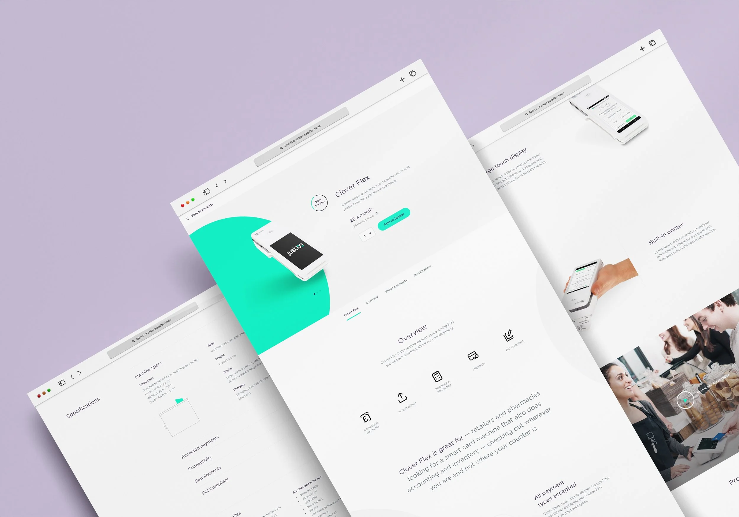
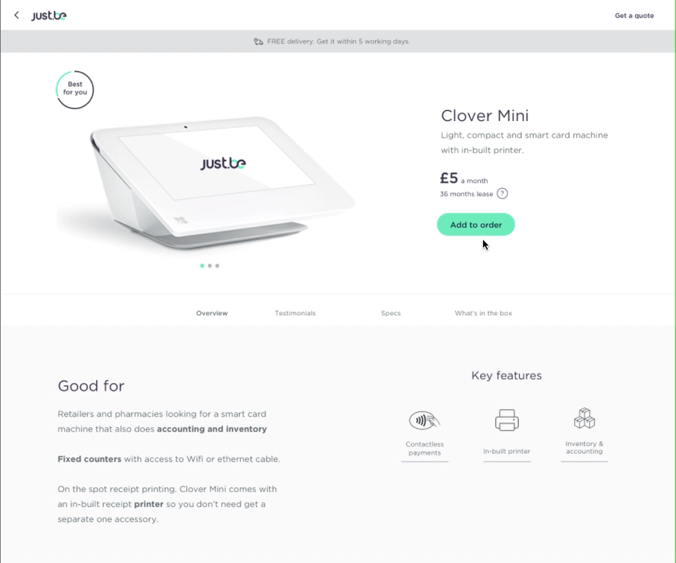
New brand guidelines created by R/GA including logos, typography, colour palette and general design rules, helped me and a junior designer guide the design of new elements and screens identified in wireframe phase. Because of the nature of the onboarding/set up process, there was a need for extensive UI elements around form validation, error handling, navigation, as well as templates for PDPs, checkout and account services across mobile and desktop breakpoints.
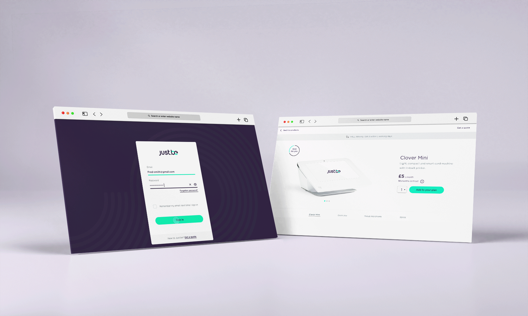
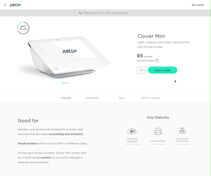
MOBILE
Product detail pages, checkout and onboarding screens with all authentication forms.

DESKTOP
Product detail pages, checkout and onboarding screens.

Motion
Below are a few examples of the type of motion and interaction principles created for JustBe project.

Button behaviour
While defining the behaviour for Product Detail Pages, user needed to be able to add potentially multiple products to the basket. We came up with a solution that added all items in a persistent order summary at the bottom of the screen, so users could navigate through checkout order with a consistent place where to store payment devices and accessories.
Variations
Variation A: Quantity value appears after adding to basket using + - symbols. Button changes colour to Just Be aubergine on rollover. A basket summary appears at the bottom of the screen.

Variation B: Quantity dropdown is always visible. Button colour changes to a darker green on rollover.
Variation C (Recommended): Quantity dropdown is always visible. Button colour changes to a Just Be aubergine on rollover.
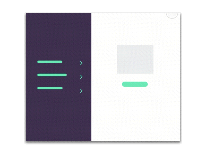
Onboarding behaviour
Onboarding a new business into JustBe platform was a process that unfortunately required quite a lot of verification steps.
The left side of this diagram shows the questions were split into sections that allowed users to see and keep track of all the section at a glance.
As users replied questions in each section, a new question appeared below the answer, until all the questions for a step were completed. Once a step was completed, a continue button was shown that allowed to move the following step.
See designs below.
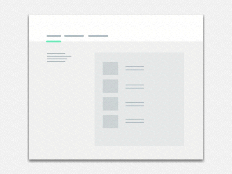
Example designs
After logging in, the Setting up an account screen shows all the steps business need to complete at glance.
Tapping on an active step expands the section on the right side, allowing users to complete answers for selected step. On mobile, this was handled in two separate screens.
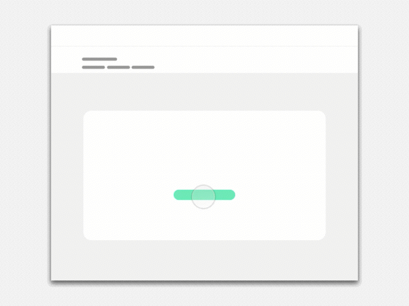
Editing information within a step opened an overlay that came from the bottom of the page so users could edit this specific steps. without leaving the set up account and without any distractions.
Transitions
To unify design patterns, I created mockup diagrams of different areas within the platform that illustrated how to handle animation transition for different page layouts.


Next project

OnTrees